“Behold”
“Behold”—drawing a response of attention and revelation. Narrative applies that invitation to Christ, helping readers behold Him as the central figure of the biblical story.



The primary wordmark is Ink on a light background, such as our in-house “Paper” or “Slate.” It is designed to represent the ancient feeling of inked text on a scroll.








The “ה” (Heh) reflects both the meaning and ancient visual of the Hebrew letterform. The custom Narrative typeface is designed to evoke the feeling of reading an ancient text while remaining legible for a modern audience.
“Behold”—drawing a response of attention and revelation. Narrative applies that invitation to Christ, helping readers behold Him as the central figure of the biblical story.
The “Heh” is formed of two other Hebrew letters, the first is the “Dalet”. The horizontal and vertical lines represent width and height; together, those dimensions represent the physical or material world. These upper and descending strokes also represent thought and speech in Jewish tradition.
The detached left leg is the “Yud”, representing God and spirituality. It expresses the call to bring holiness into the physical world (Dalet). It’s also thought to represent action, so together the “Heh” also symbolizes thought, speech, and action—everything required to bring spiritual truth into a physical world.
The complete form becomes the opening letter of the Narrative wordmark—carrying its ancient structure into a modern identity built to help people See Scripture as one narrative about Jesus.
OUR MISSION
Narrative visually connects the people, places, and events of the Bible without leaving the page.
Artwork is presented as part of the reading experience rather than as decoration. Full-screen biblical imagery supplies atmosphere and visual context while typography and metadata keep the story clear.
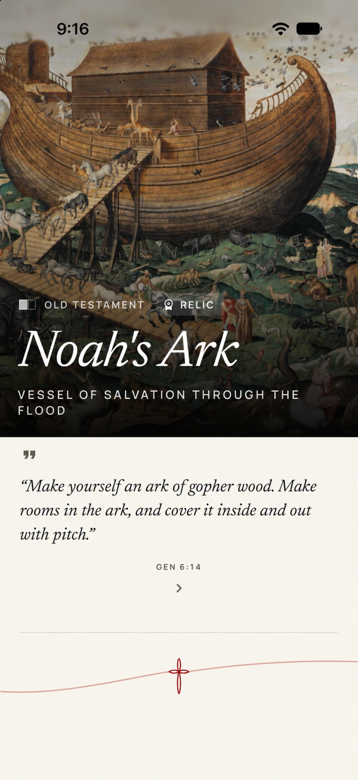
This “card” screen demonstrates how classical biblical imagery, restrained overlays, and editorial typography work together. The artwork establishes the card’s primary content immediately; the interface then supplies context without competing for attention.
Ink (black) and Paper (taupe) are the central color themes across the brand and the Narrative Bible app, especially within the Bible reader itself. The ancient scroll aesthetic immerses users in the experience of opening God’s timeless Word. The traditional black, white, and monochrome palette also avoids competing for attention with the vibrant, multicolor Christian artwork featured throughout the app.


The Scarlet red accent is the most important color of all. It is used across Narrative products exclusively in association with Christ. The “scarlet thread” is a core feature of the Narrative Bible app, helping users see the endless connections the Bible makes to Jesus throughout both the Old and New Testaments.